Mastering the financial markets requires more than just luck; it demands a deep understanding of price action, market psychology, and proper trading education to navigate turbulent trends effectively. When you open a price chart, every single red or green rectangle tells a vivid story of fear, greed, hesitation, and ultimate victory between buyers and sellers. Learning how to decode these visual blocks allows you to anticipate market shifts before they happen, transforming confusing price movements into clear opportunities. Whether you are trading foreign exchange, commodities, or equities, understanding price behavior is the foundational skill that separates consistent participants from struggling amateurs. At Funded Squad, we believe that empowering participants with robust analytical skills is the key to unlocking true market independence.
Unlocking Market Insights Through Structured Trading Education
A comprehensive trading education provides the solid framework necessary to interpret complex price data without emotional bias or hesitation. Markets move in waves driven by human emotion, and price charts are simply the historical record of these collective psychological battles. Beginners often look at charts and see random noise, but trained analysts see structured patterns repeating across different timeframes. Developing this analytical eye takes time, patience, and exposure to real market conditions. By studying how historical price action repeats itself, you build the pattern recognition skills needed to make objective decisions under pressure.
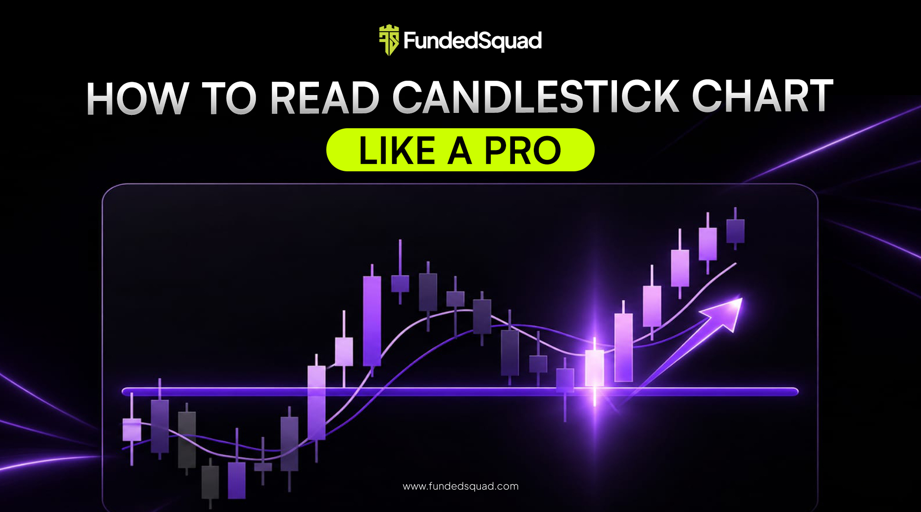
Understanding the anatomy of a price bar is the first critical milestone in your analytical journey. Every standard data point consists of a thick body and thin extensions known as wicks or shadows. The body represents the distance between the opening price and the closing price during a specific timeframe. If the close is higher than the open, the block is typically green or white, signifying buying pressure. If the close is lower than the open, the block is red or black, signifying selling pressure. Wicks illustrate the absolute highest and lowest prices reached during that specific period before buyers or sellers pushed the price back.
The Rich History and Anatomy of Japanese Candlesticks
The origin of modern price charting dates back centuries to Japanese rice merchants who tracked market sentiment using visual blocks. These early traders realized that collective trader psychology could be mapped visually to predict future price directions. Today, traders around the globe rely on Japanese candlesticks to gauge immediate market sentiment and spot turning points. Each individual shape gives you a snapshot of market control within a specific timeframe, whether that is one minute, one hour, or one day.
To help you visualize how different data points form, here is a quick reference table comparing the primary components of individual price blocks.
| Component | Description | Market Meaning |
| Real Body | The thick part between open and price close | Shows the dominant directional force |
| Upper Wick | Thin line extending above the body | Shows how high prices were rejected |
| Lower Wick | Thin line extending below the body | Shows how low prices were rejected |
When evaluating these formations, context is always more important than isolation. A single block appearing at a major support level carries vastly different implications than the exact same shape appearing in the middle of a sideways range. Successful analysis requires looking at the surrounding trend, volume, and adjacent price bars to confirm your bias. This holistic approach prevents you from reacting impulsively to every minor market fluctuation.
Spotting Reversal Patterns at Critical Market Extremes
Market trends do not last forever, and spotting exhaustion early can save you from painful drawdowns and capital loss. Reversal patterns signal that the current prevailing trend is losing momentum and that the opposing side is preparing to take control. These formations often appear at key technical levels such as previous swing highs, psychological round numbers, or major moving averages. Recognizing these shifts allows you to lock in profits or position yourself for the upcoming counter-trend movement.
One of the most reliable visual cues of a pending trend reversal is the engulfing pattern, where a larger body completely overtakes the smaller body of the previous period. For a bullish reversal, a strong green body completely swallows the body of the preceding red candle. This indicates that buyers have aggressively stepped in and overwhelmed the previous sellers. For more insights on how we support growth oriented participants, you can visit Funded Squad to explore our community resources.
Bullish Engulfing Formations
A bullish engulfing setup typically forms at the bottom of a prolonged downward move, signaling seller exhaustion. The second candle opens lower than the previous close but rallies strongly to close well above the previous open. This sudden shift in momentum catches late sellers off guard and forces them to cover their short positions. Watching for high trading volume during this engulfing bar adds significant confirmation to the validity of the reversal.
Bearish Engulfing Formations
Conversely, a bearish engulfing setup appears at the top of an extended uptrend, warning of impending exhaustion among buyers. The second candle opens higher than the previous close but faces intense selling pressure that drives the price down below the previous open. This dynamic reveals that supply has completely outstripped demand at those higher price levels. Recognizing this shift allows active participants to exit long positions or prepare for short setups.
Related Blog: Day Trading vs Swing Trading: Finding Your Style
Navigating Continuation Patterns During Strong Trends
While turning points grab a lot of attention, continuation patterns are equally important for riding established market trends. These formations suggest that the market is taking a brief pause or consolidation before resuming its original direction. Trading alongside the primary momentum is statistically safer than trying to catch every single top and bottom. Learning to spot these continuation flags and pennants helps you stay in profitable trades longer without panicking during minor pullbacks.
During a strong upward trend, you will often notice small indecision blocks forming as early buyers take brief profits. These small bodies show that the market is resting rather than reversing its underlying direction. To learn more about our foundational mission and core values, feel free to check our about page for complete company details. When the market breaks out of this tight consolidation range in the direction of the main trend, it offers a high probability entry point.
Recognizing Neutral Indecision Through Doji Candles
Sometimes the market reaches a state of total equilibrium where neither buyers nor sellers can claim victory over the designated timeframe. Doji candles represent this exact moment of hesitation, featuring extremely small bodies where the open and close are virtually identical. These neutral formations tell you that the previous trend is losing its conviction and that market participants are waiting for a new catalyst. Ignoring these warning signs often leads to unexpected whipsaws and unnecessary losses.
When a doji appears after a long directional move, it acts as a yellow light urging caution for active positions. If the next price bar opens and closes in the opposite direction with strong momentum, it confirms that a reversal is underway. You should never trade a doji in isolation without waiting for the confirmation of the subsequent candle. Combining these neutral shapes with momentum indicators provides a much clearer picture of true market intent.
Maximizing Your Growth Potential With Advanced Solutions
Navigating the financial markets successfully requires not only analytical skill but also access to an environment that supports your professional growth. With over 30k+ active traders and 2M+ performance rewards distributed globally, our ecosystem is built to foster true excellence. Participants enjoy incredible flexibility with no consistency rules, allowing you to trade your preferred style without artificial constraints. If you want to learn how our partnership initiatives work, you can explore our partner section for collaboration opportunities.
Furthermore, our platform offers rewards on demand with a reward split up to 100% to ensure your hard work is fully recognized. We remove common barriers by enforcing no time limit and having no withdrawal threshold, giving you absolute control over your financial journey. If you ever have questions or need assistance navigating our account tiers, our support team is always ready to help through our contact page.
Frequently Asked Questions
What is the most reliable candlestick pattern for beginners?
The engulfing pattern is widely considered one of the most reliable and easiest formations for beginners to identify on a chart. It provides clear visual evidence of market dominance when a larger body completely overtakes the previous period.
How do I confirm a reversal signal on my charts?
Confirmation requires looking at the next candle, trading volume, and surrounding technical levels like support or resistance. Entering a trade purely on a single reversal candle without confirmation increases your exposure to false breakouts.
Why do doji candles matter in technical analysis?
Doji candles highlight market indecision and equilibrium between buyers and sellers after a directional move. They act as early warning signs that the existing trend is pausing or losing momentum.
Can I use price charts on any timeframe?
Yes, price charts can be applied to any timeframe ranging from one-minute intraday charts to monthly macro charts. The core principles of reading price action and market psychology remain identical across all timeframes.
How do continuation patterns differ from reversal patterns?
Continuation patterns indicate that the market is pausing briefly before resuming its primary trend direction. Reversal patterns, on the other hand, signal a permanent shift in momentum from buyers to sellers or vice versa.
Conclusion
Mastering price charts is an ongoing journey that combines technical study, emotional discipline, and continuous trading education to achieve consistent results. By understanding the anatomy of individual blocks, spotting reliable reversals, and respecting neutral indecision, you can interpret market movements with confidence. Always prioritize risk management and wait for proper confirmation before executing any market order. Through dedication and continuous practice, you can transform complex price charts into your most powerful analytical tool.